MA Capstone
Morgan Creek Vineyards is a family owned business that is located in the southern Minnesota. They were the first winery to open in the region and the 5th winery to be built in the state. The winery is owned by a husband and wife duo, Georg and Paula Marti, where they have their two sons, Adam and Ben, working side by side to support the business. The Marti’s are known to be pioneers and creative thinkers. They used to own a music school teaching the Suzuki method. With their latest endeavor they are aspiring to be a biodynamic vineyard & winery. The owners want to incorporate the concept of biodynamics into their winery branding.
Project Details
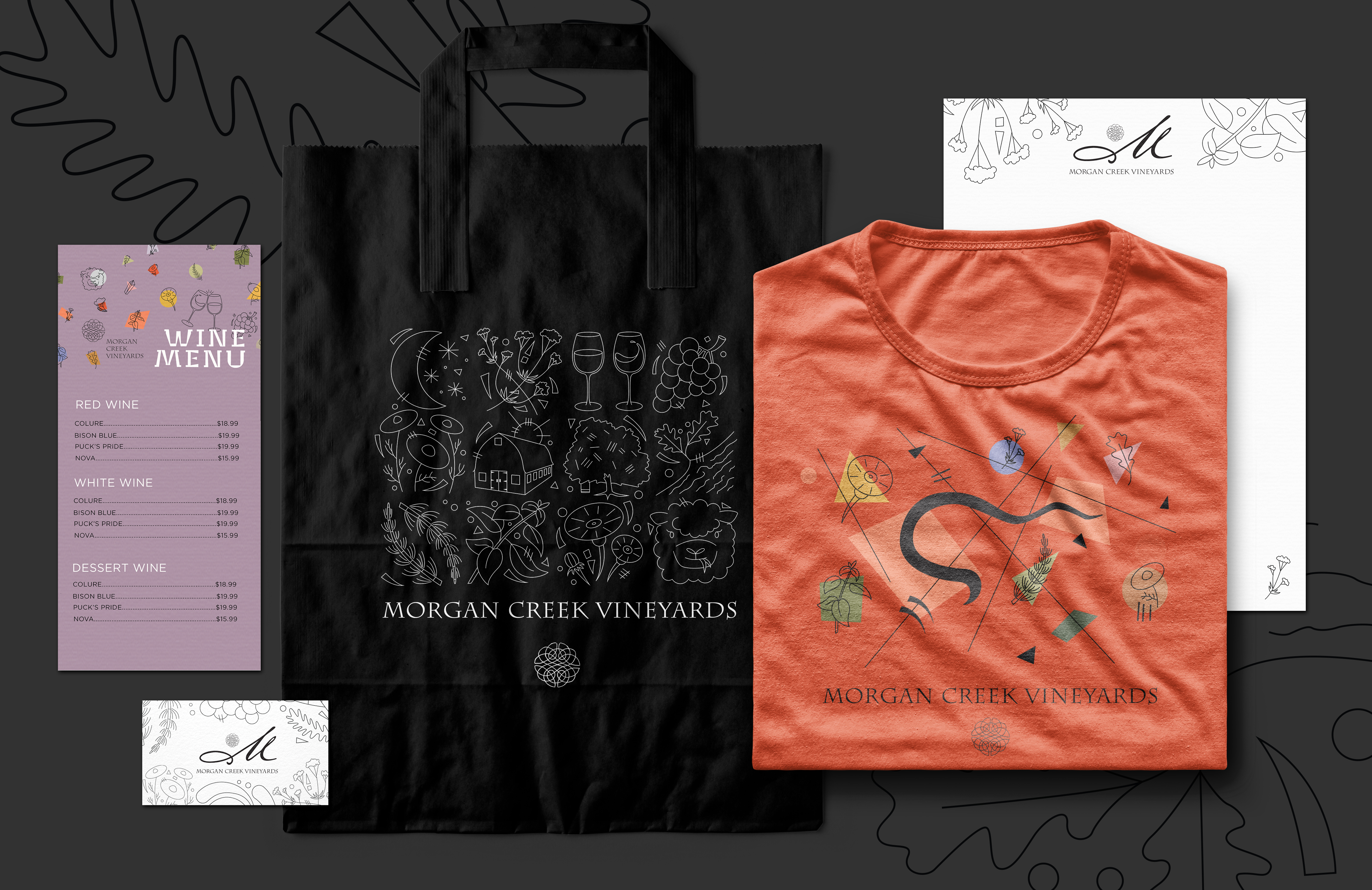
This project involved expanding the existing Morgan Creek brand with an icon series and label series. The creative goal was to express and promote biodynamics through the branding.
- Iconography
- Label Design
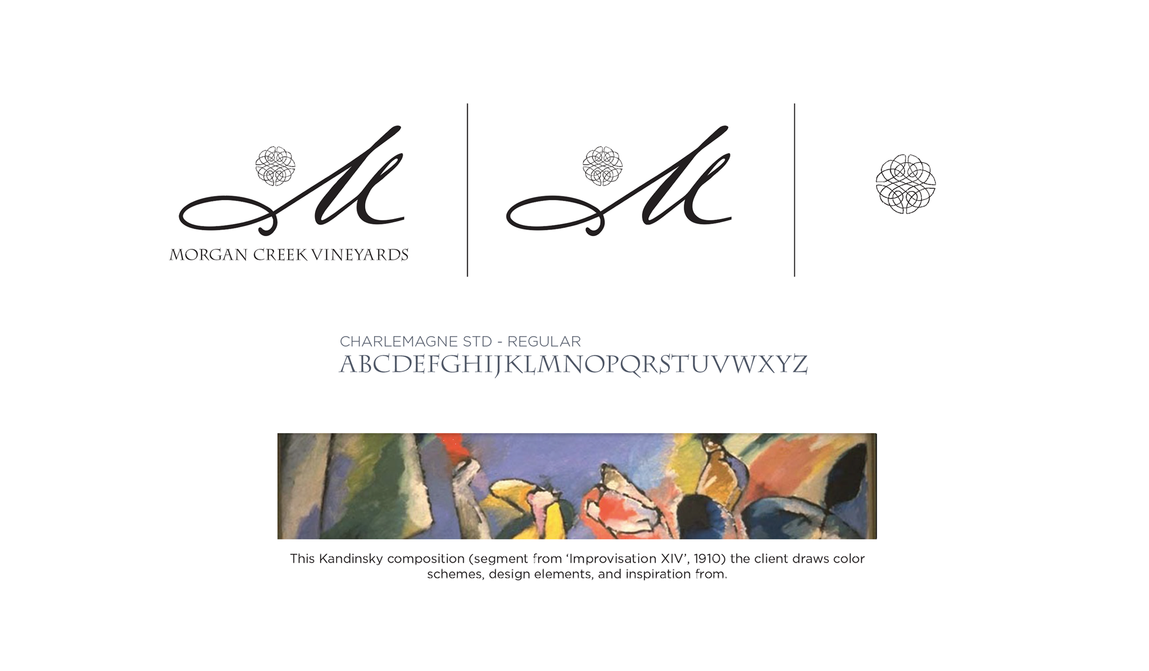
Existing Brand
Here is the established brand for Morgan Creek Vineyards. The Celtic knot represents the four seasons, interconnection, and the owner’s Irish heritage. The font Charlemagne STD – Regular complements the Celtic knot. The swooping ‘M’ represents the Morgan Creek and is also the initial to the business. The image below demonstrates how the logo breaks down into its smaller size, what the standard font looks like, and shows the composition the business uses.
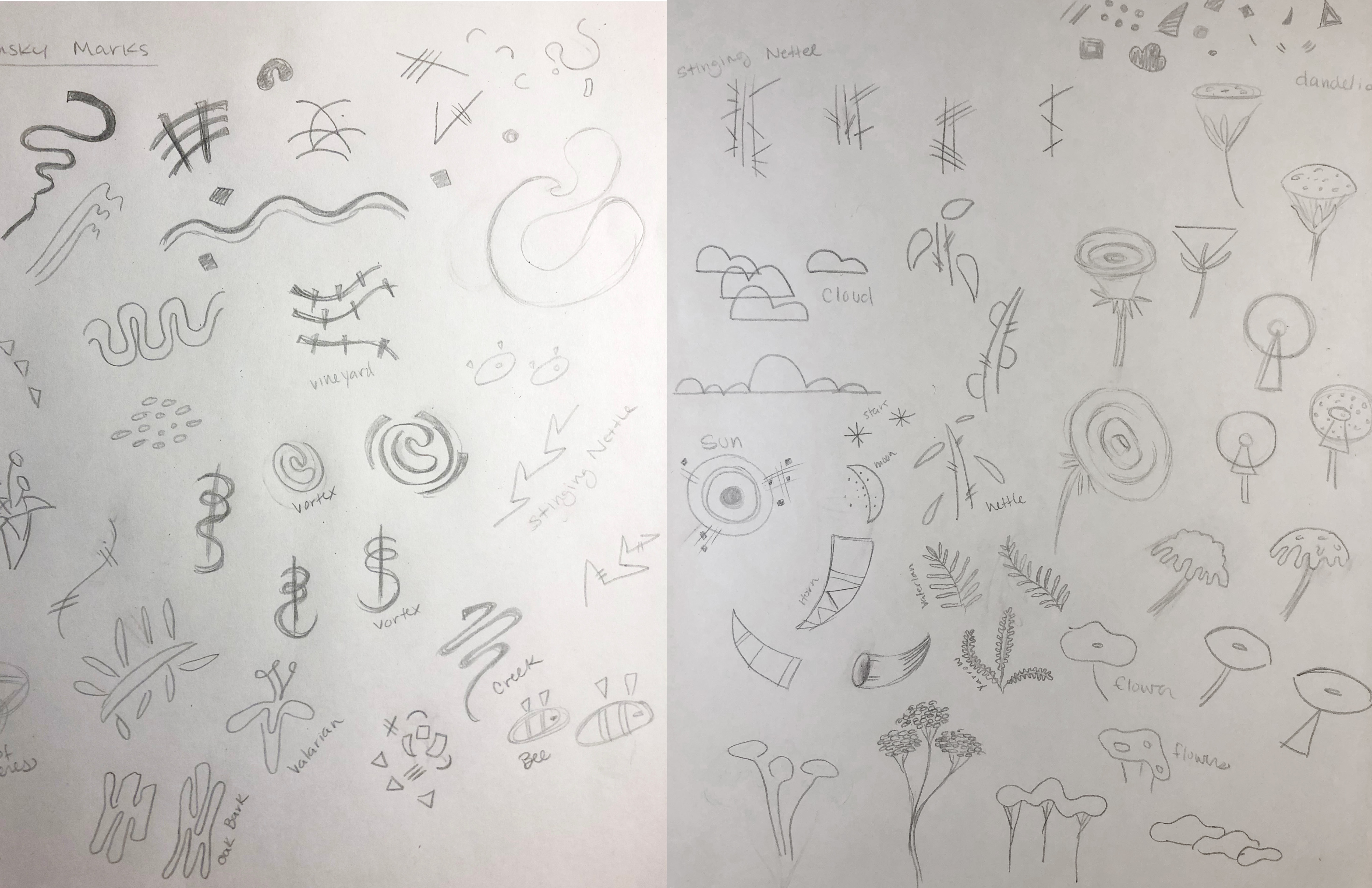
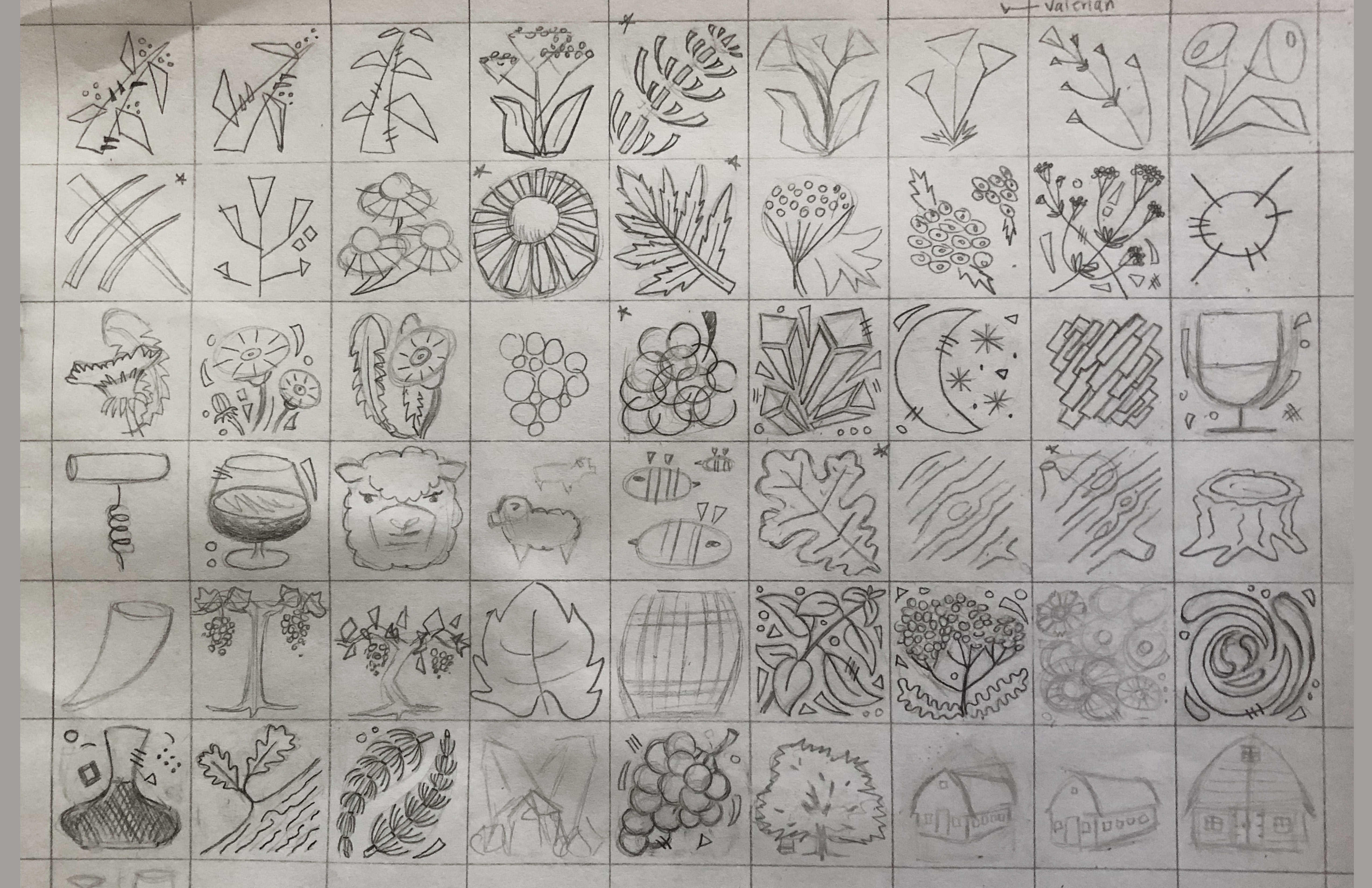
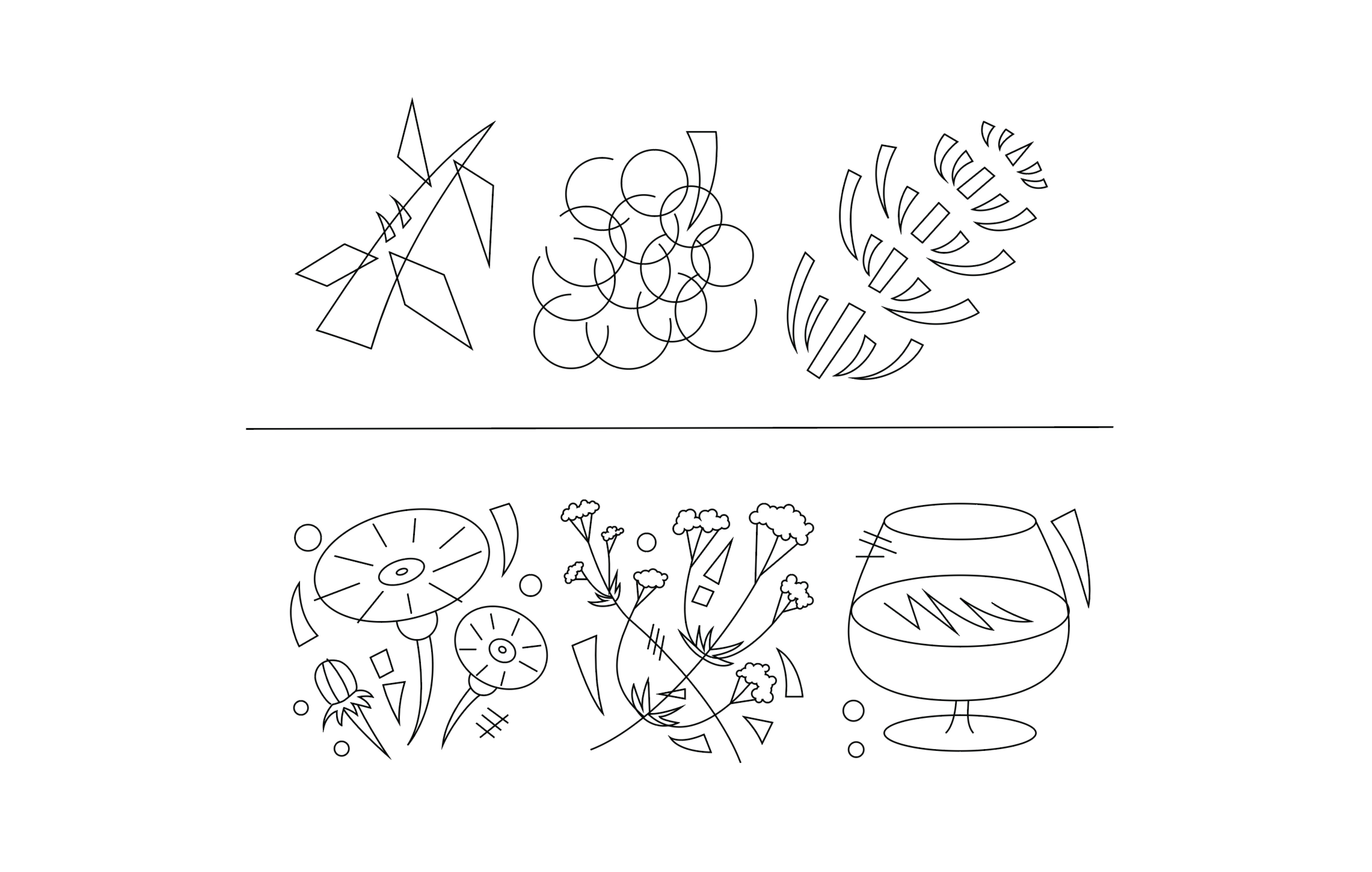
Icon Series
These icons need to reflect the biodynamic 9 preparations that are iconic in the movement, as well as making symbols that pertain only to Morgan Creek Vineyards.
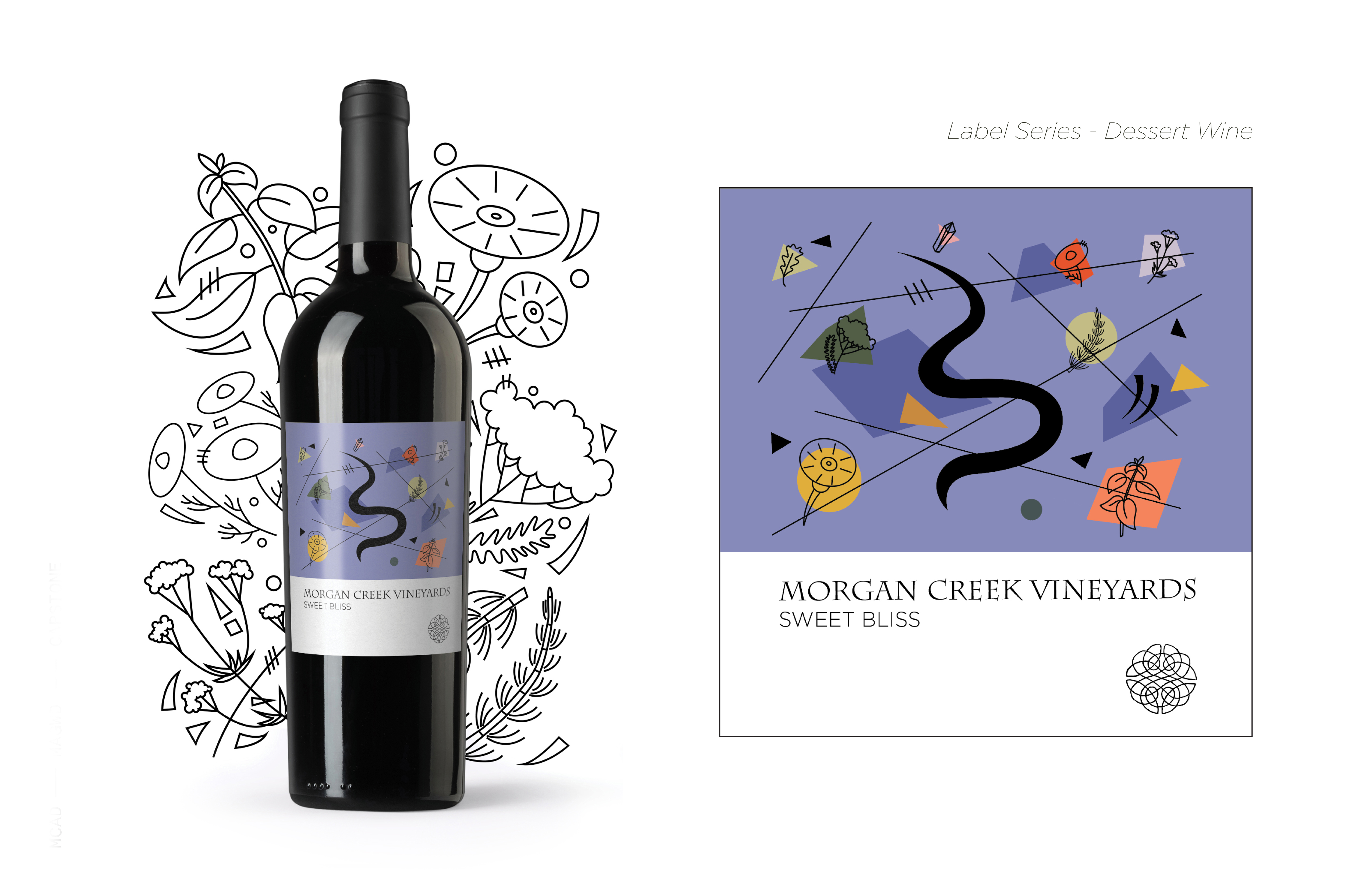
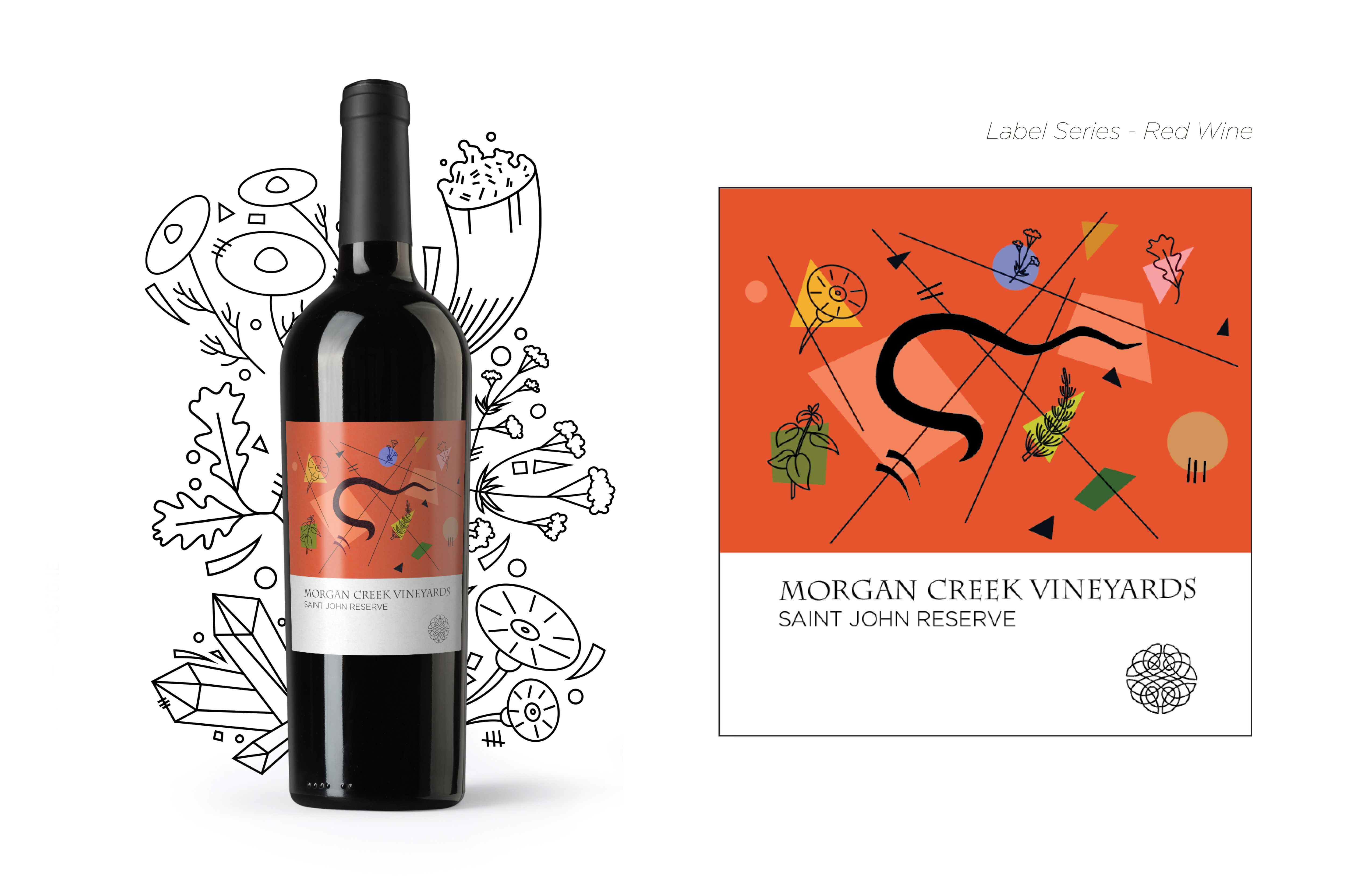
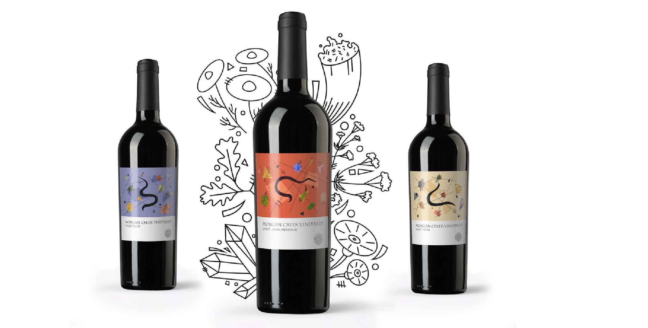
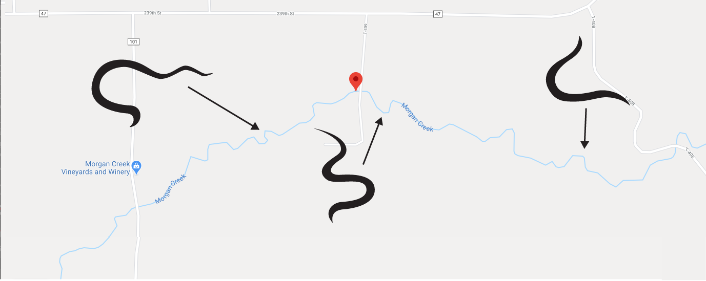
Lablel Inspiration
Abstracted gestural lines from the Morgan Creek where the winery resides. Chose 3 different areas of the river that would have a different line gestures to create variety between the different wine labels. Drawing these lines from the Morgan Creek itself further tailored the design for only Morgan Creek Vineyards.
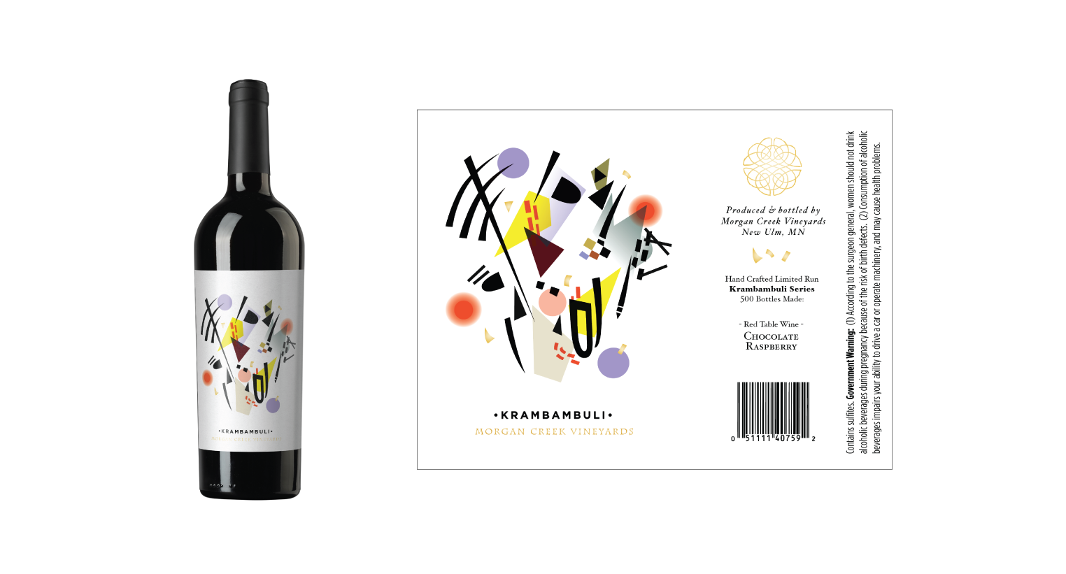
Wine Label Series
The wine labels have lots of meaning in them. The grid-like line gestures represent the landscape. The abstracted icons from the larger icons represent the biodynamic plants grown at the vineyard. The creek flowing through the property provides a focal point, and the rectangles represent the buildings. The color scheme was pulled from the Kandinsky painting that was used in the original brand (segment from ‘Improvisation XIV’, 1910).